CT Layouts Editor: Customize Tabs
The CT Layouts Editor opens when the administrator clicks the Builder button on the desired Layout Settings record and is used to set up tabs on the screen for the specified object.
In this article, take a look at the layout editor and the available settings for tabs:
|
Tab and Path Modes
The record screen may be presented in the Tab or Path mode.
Tab Mode
The Tab mode is suitable for a more advanced presentation of information separated and distributed to individual tabs.
-
The mobile user navigates through the tabs on the record screen in any order to review data and fill in the required information.
-
The administrator cannot customize the color and icon of the tab header, set statuses for each tab, or use global tab actions.
Path Mode
The Path mode is suitable for running scenarios.
-
The mobile user sequentially navigates through tabs on the record screen and works with the presented records.
-
The administrator can set the color and icon of the tab header, add buttons with a set of actions, and set statuses that will change during the scenario.
-
The administrator can allow users to switch between tabs outside the specified sequence. So, the user can navigate among tabs and return to the current one in the scenario by tapping the Return button without changing the visited tab status.
Editor Overview: Tabs
The first step is to select the Tab or Path mode, specify the required number of tabs, and set up general settings for each tab.
Main Screen
-
In the header, the Name of the current object record type is displayed, for example, Visit Steps.
-
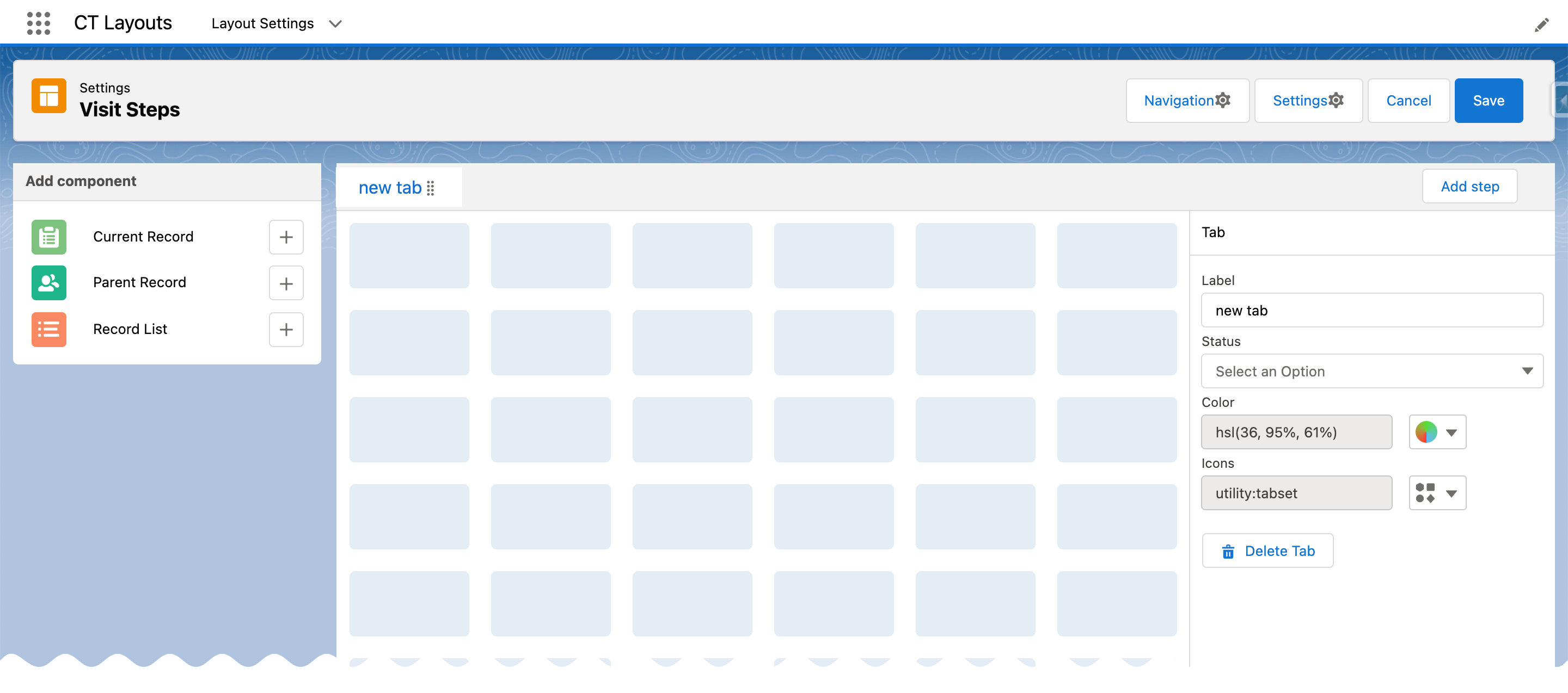
Click the Settings button to set the Tab or Path mode and specify additional high-level options for the selected mode.
-
Click the Navigation button to set the actions of the buttons for each tab in Path mode.
Available when the Path mode is selected. -
Click Save to save the setup.
-
All settings will be validated. In case of errors, the alert with the error will be shown.
-
All made settings or changes will be saved for the current Layout Settings record.
-
-
Click Cancel to exit from the Editor without saving the settings.
-
-
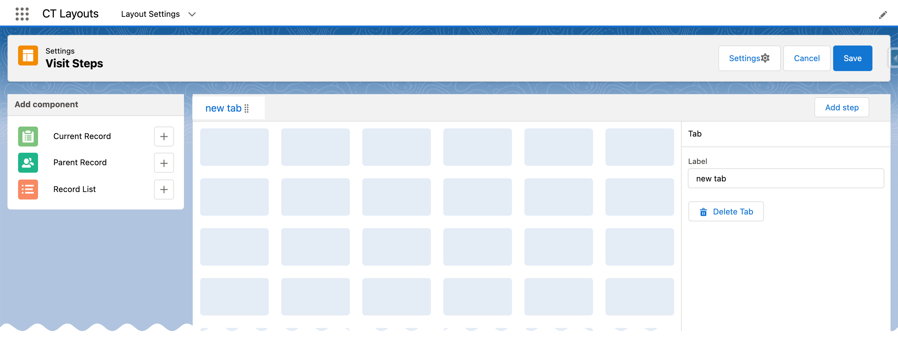
Click the New Tab header to display the grid.
-
On the right side:
-
Tab Mode
-
Path Mode
-
Specify the name for the first tab in the Label field.
-
Click Add Step to add a new tab.
-
Drag-and-drop the tab header to change the tab order.
-
Click Delete Tab when the required tab is open to remove it.
-
Specify the name for the first tab in the Label field.
-
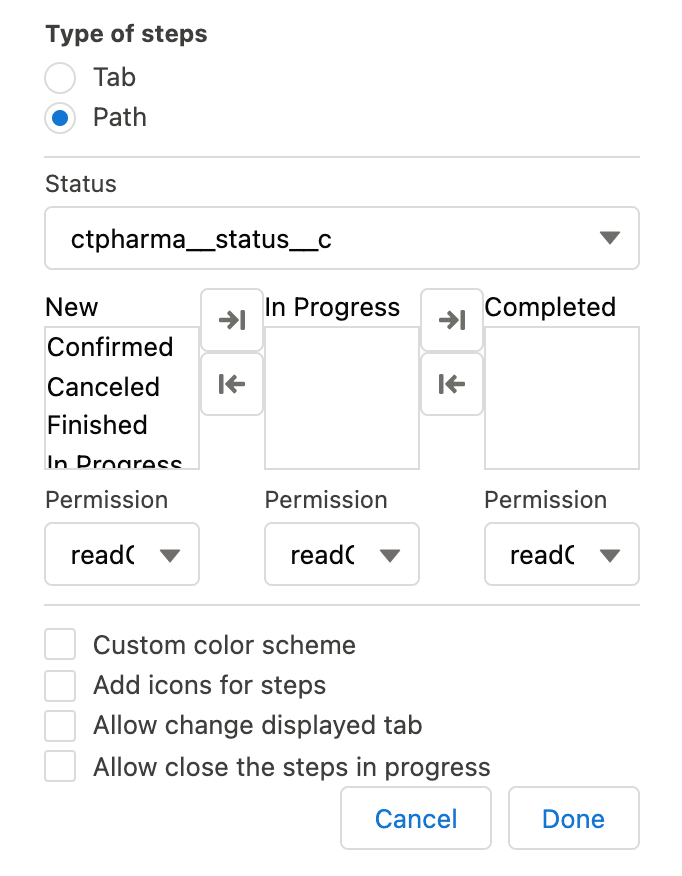
Select the Status option.
-
If enabled in the Settings button:
-
Set up a color scheme for each tab in the Color field.
-
Specify icons for each tab in the Icons field.
-
-
Click Add Step to add a new tab.
-
Drag-and-drop the tab header to change the tab order.
-
Click Delete Tab when the required tab is open to remove it.
-
-
On the left side:
-
Click the
 button to add the desired section to the grid.
-
Tab Mode
-
Path Mode
-
-
The Settings Button
-
Tab Mode
-
Path Mode
The Tab mode is set by default. If needed, click the Settings button to activate the Allow close the steps in Progress checkbox to allow mobile users to close the modal window when the step still has In Progress status.
-
Click Done to save the setup.
-
Click Cancel to return to the Editor page without saving the settings if they were edited.
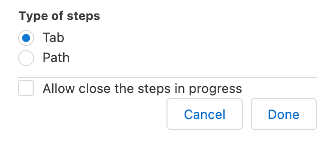
Click the Settings button and select the Path type. Every tab in the Path mode should have its own status.
|
|
The Navigation Button
| Available when the Path mode is selected. |
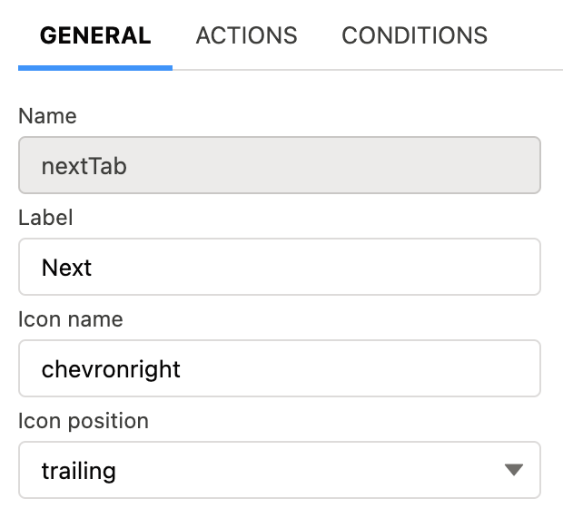
Click the Navigation button to set up the actions button for Path mode. By default, such buttons are available:
-
Previous — go to the previous tab.
-
Next — go to the next tab.
-
Return — return to the current tab from the displayed tab that the mobile user previously opened by tapping its header.
-
Start — start the action.
-
Finish — finish the action.
-
Cancel — cancel the action.
-
Create Record — to create a record for a certain object.
-
Generate CG Cloud tasks — generate assessment tasks and visit KPIs.
We recommend adding the condition to hide the button if related assessment tasks were already created. This will prevent the creation of duplicates.
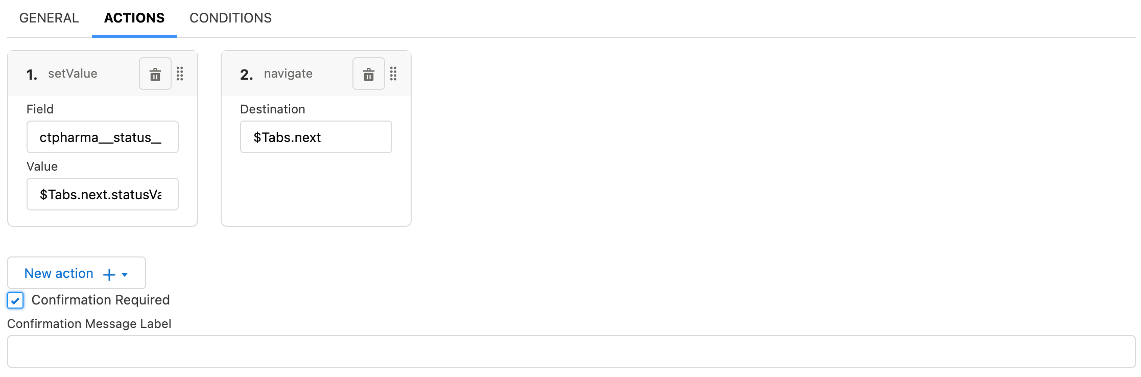
Click the button for setup, perform customization and then click Save to apply the settings.
General
For each button on the General tab:
|
|
Actions
| Not available for the Return button. |
For each button on the Actions tab, set the scope of the actions triggered when the mobile user taps the button.
|
|
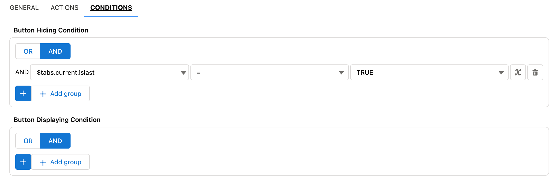
Conditions
| Not available for the Return button. |
Specify conditions to hide or display the selected button.
|
|