CT Layouts Editor: Add Sections and Fields
In this article, take a look at the layout editor and the available settings for sections and fields on the tabs:
|
Editor Overview: Sections
When tabs are added, the administrator fills them with the desired sections.
Each tab may have several sections, which are located on the grid and occupy a number of grid units.
-
The layout grid cannot be more than 6 units in width.
-
The layout grid height may be enlarged.
Sections obey the following rules:
-
To add a section, click the
 button next to one of the available section types.
 -
When added, the section has a minimum size of 2 units wide and 1 unit high.
-
Sections are added one after the other, starting from the leftmost top corner of the grid.
-
Sections cannot overlap each other.
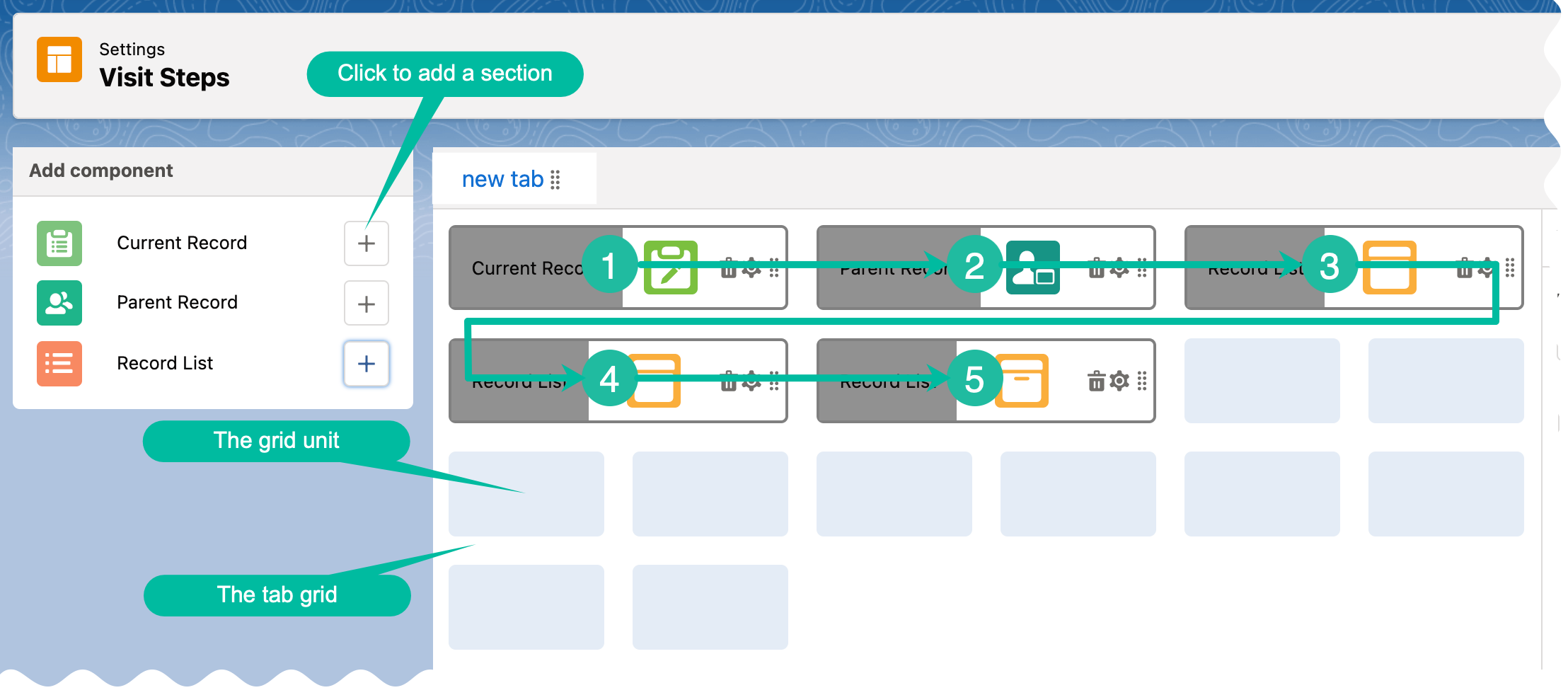
Each section has the following structure on the grid:
|
|
There are three section types:
-
Current Record
-
Parent Record
-
Record List
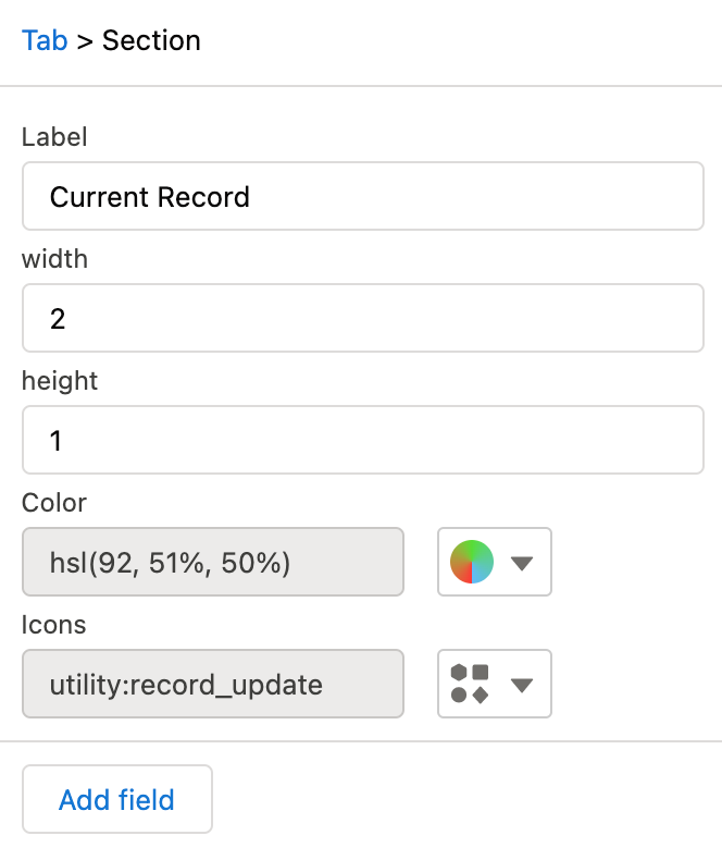
Current Record
Use this section to display and manage data of the specified object in the Layout Settings record. On the left side, click the
|
|
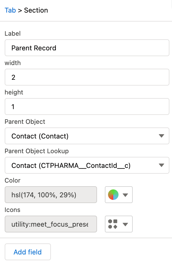
Parent Record
Use this section to display and manage data of the parent object of the specified object in the Layout Settings record. On the left side, click the
|
|
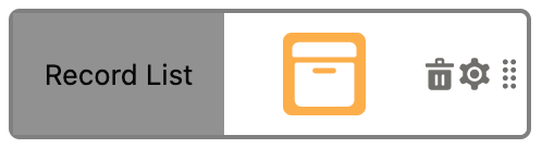
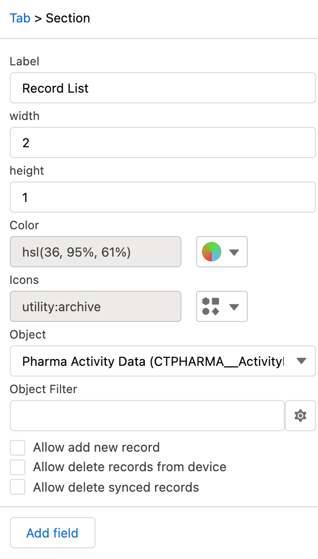
Record List
Use this section to display and manage data of the related objects of the specified object in the Layout Settings record. On the left slide, click the
|
|
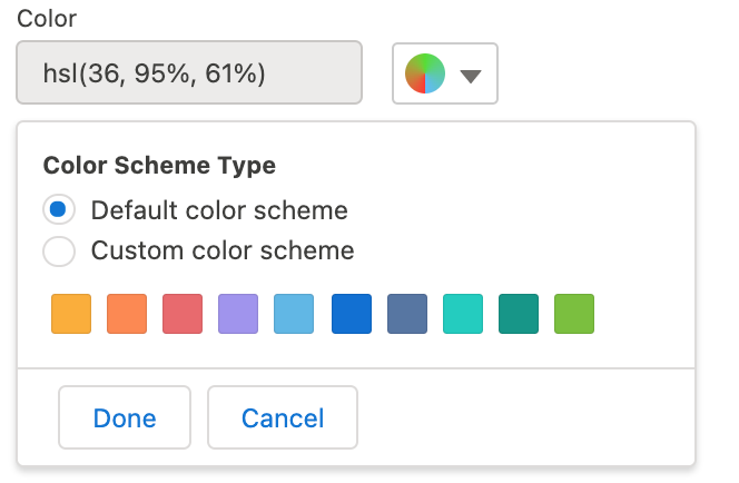
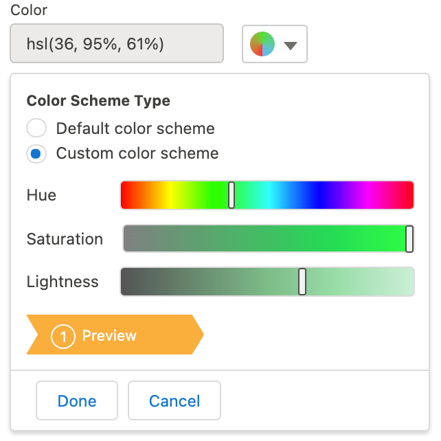
Section Color
In the section settings, specify the section color that highlights the section header in the CT Mobile app.
-
By default, the section color is a random color.
-
Choose a color either from a predefined set or by specifying the hue, saturation, and lightness of custom color.
Lightness cannot be more than 80%. -
Click Done to save changes.
-
Click Cancel to cancel the color adjustment.
| Default Color Scheme | Custom Color Scheme |
|---|---|
|
|
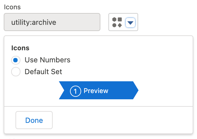
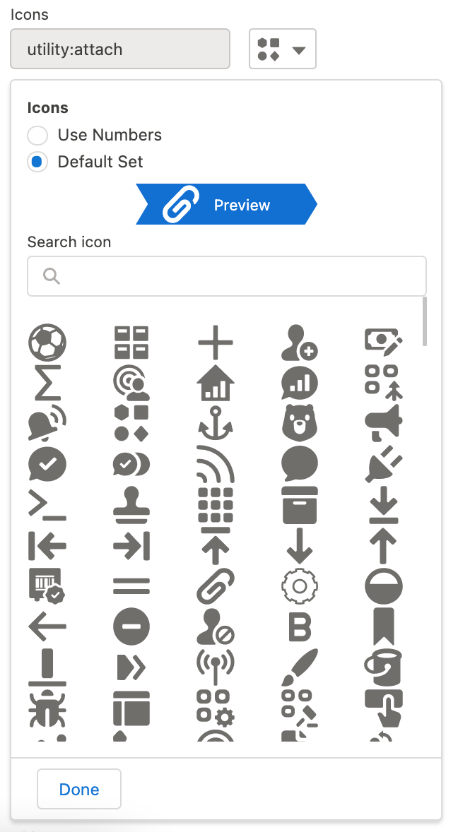
Section Icon
In the section settings, specify the section icon that appears in the section header in the CT Mobile app.
-
By default, the section icon is a random icon.
-
Use the numbers that will be assigned to the section according to its ordinal number.
-
Select the icon to display from the list of available icons.
-
Use the Search box to find an icon by its name.
-
Click Done to save changes.
| Numbers | Icons |
|---|---|
|
|
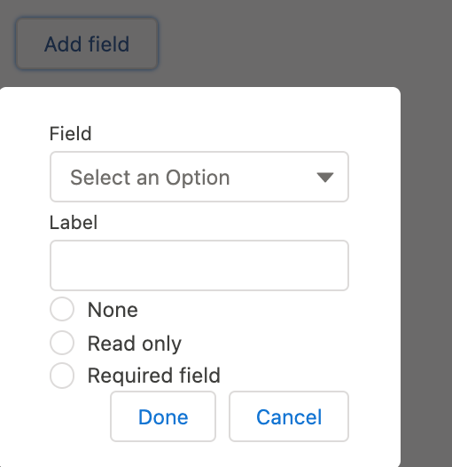
Section Fields
In the section settings, click the Add Field button (if available). In the window:
-
In the Field picklist, select the fields to display inside the section.
For the Record List section, only the fields that match the criteria will be displayed for selection if a filter is set. Also, it is possible to add fields of the parent object in the ParentObject.Field format. In the picklist, the API name of the field is additionally specified in brackets. -
Add Label.
-
If necessary, specify whether the field should be read-only or required to fill in.
The Field-Level Security settings for the field are higher than the field settings in the CT Layouts.
-
If the field is hidden from the mobile user, then the field will not be presented in the section for the mobile user.
-
If the field is readOnly for the mobile user, then the field should not be editable in the section for the mobile user.
-
If the field is required for the mobile user, then the field will be required in the section for the mobile user.
-
-
Click Done to save changes.
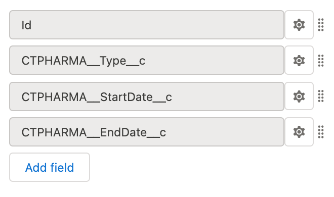
The list of added fields is displayed under the section settings.
-
Click the
 icon to open field settings and make any changes.
 -
Click and hold the
 icon to change the field order.
| The Add Field Window | Added Fields |
|---|---|
|
|